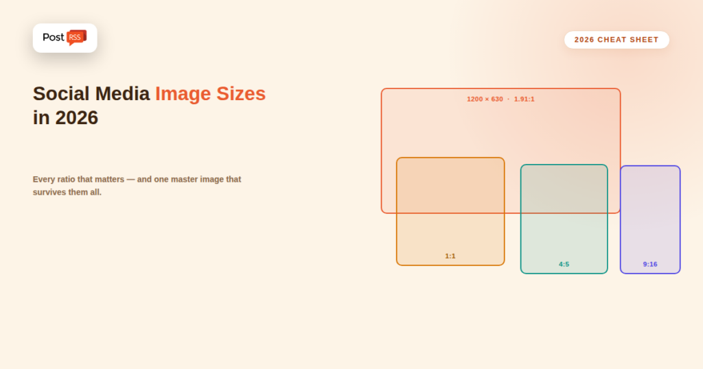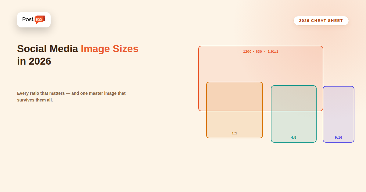
Image dimensions are one of those details that quietly decide whether an automated post looks professional or looks broken. The same image that renders beautifully on LinkedIn can arrive on Instagram with the top of someone’s head cropped off, or appear on X as a letterboxed strip with grey bars on either side. This guide covers the sizes that actually matter in 2026, why automated posts are especially vulnerable to cropping problems, and the practical approach that lets one well-made image work across every platform you distribute to.
When you post manually, you see the crop preview before publishing and can adjust. Automation removes that checkpoint by design — that’s the point of it. An image pulled from your RSS feed goes out to Facebook, X, LinkedIn, and Pinterest simultaneously, and each platform applies its own crop rules without asking. If your source image doesn’t survive those crops, you find out afterward, usually from the post that already went to your entire audience.
The fix isn’t to abandon automation or to produce a separate image per platform for every post. It’s to understand which ratio each platform crops toward and to design source images that degrade gracefully when cropped.
Before the full table, here’s the shortcut that solves the majority of cases:
If you produce nothing else, produce these two. Everything below is refinement.
| Platform & format | Recommended size | Ratio |
|---|---|---|
| Facebook — link preview card | 1200 × 630 | 1.91:1 |
| Facebook — feed image post | 1200 × 1500 | 4:5 |
| Facebook — Stories / Reels | 1080 × 1920 | 9:16 |
| Instagram — square post | 1080 × 1080 | 1:1 |
| Instagram — portrait post | 1080 × 1350 | 4:5 |
| Instagram — Stories / Reels | 1080 × 1920 | 9:16 |
| X (Twitter) — large summary card | 1200 × 628 | 1.91:1 |
| X (Twitter) — in-stream image | 1600 × 900 | 16:9 |
| LinkedIn — link preview card | 1200 × 627 | 1.91:1 |
| LinkedIn — feed image post | 1200 × 1500 | 4:5 |
| Pinterest — standard Pin | 1000 × 1500 | 2:3 |
| Pinterest — long Pin (max) | 1000 × 2100 | 1:2.1 |
| YouTube — thumbnail | 1280 × 720 | 16:9 |
| Threads / Bluesky — image post | 1080 × 1350 | 4:5 |
Treat these as targets rather than absolute law. Platforms adjust rendering periodically, and the ratios above are far more stable than the exact pixel counts — a 1600×840 image and a 1200×630 image both sit at 1.91:1 and will crop identically.
The most useful mental shift: platforms crop based on aspect ratio, then scale to whatever resolution they serve. A 2400×1260 image and a 1200×630 image are the same shape and get treated identically, with the larger one simply downscaled. What causes visible damage is a ratio mismatch — feeding a 1:1 square into a slot that wants 1.91:1 means roughly the top and bottom thirds get discarded, and if that’s where your headline text sits, it’s gone.
So the practical rule is: get the ratio right first, then make sure resolution is high enough to look sharp on a high-density display. Doubling the recommended dimensions is a reasonable habit; going far beyond that mostly adds file size without visible benefit.
Because different platforms crop the same image slightly differently, professional social designers work with a “safe zone” — the central region of the image that survives every crop. In practice:
Design once with a generous safe zone, and a single image can serve a 1.91:1 card, a 1:1 square, and a 4:5 portrait crop without any version looking broken.
Dimensions are only half the story. Three technical constraints regularly break otherwise-correct images in automated posting:
Format. JPEG and PNG are universally supported. Use JPEG for photographs and PNG for graphics with flat colour, sharp edges, or transparency. WebP support remains inconsistent across social crawlers, and SVG is not supported as a preview or post image on the major platforms — a feed whose images are SVG will consistently produce imageless posts.
File size. Aim for well under 1 MB. Very large files risk timing out when a platform’s crawler fetches them, which produces the same visible result as having no image at all. Compression to around 80% JPEG quality is usually indistinguishable from the original at feed size.
Accessibility. A publicly reachable HTTPS URL is required. Images behind a login, on a staging domain, or protected by hotlink rules that block unfamiliar user agents will fail silently for every platform crawler.
Understanding the chain helps you control the outcome. For a typical RSS-driven automated post, the image comes from one of these sources, roughly in this order of precedence:
<enclosure> element or a <media:thumbnail> tag.og:image tag on the destination page, which is what the platform itself uses when rendering a link preview card.This is why two posts from the same site can show different images: one may be a native image post using the feed’s enclosure, while another is a link post where the platform ignored the feed entirely and read the page’s Open Graph tag. If your card images look wrong specifically on link posts, the fix belongs on the page rather than in the feed.
Tools like PostRSS pass through whatever image the feed provides for the formats that support it, which means the quality and shape of what gets posted is largely determined upstream — by the images you attach to your source content in the first place.
Producing platform-specific images for every post defeats the purpose of automation. This workflow keeps the effort low:
og:image on the source page, so link cards and feed-based posts agree.Using the blog’s inline image as the social image. Article images are often wide and short, or tall and narrow, because they’re designed to sit in a text column. Neither shape survives social cropping well.
Text too small to read at feed size. A preview card in a mobile feed may render only a couple of hundred pixels wide. Text that looks fine on your monitor at full size can be unreadable there — a good check is to shrink the image to 350 pixels wide and see whether the headline still reads.
Relying on transparency. A PNG with a transparent background composites against whatever colour the platform uses, which differs between light and dark mode. A logo that looks clean on white can vanish on a dark background. Always give social images an explicit background.
Ignoring dark mode. A large share of users browse in dark mode. Images with near-white backgrounds glare in a dark feed; images with very dark backgrounds can look like empty space. Mid-tone or clearly branded backgrounds are safer.
Assuming the platform will letterbox rather than crop. Most platforms crop to fill rather than shrink to fit. Extra margin around your content is not protection; it just means more of your actual content sits closer to the crop line.
This has shifted meaningfully over the past few years. Landscape used to be the safe default because feeds were viewed on desktop and link cards dominated. Mobile consumption changed that calculation: on a phone screen, a 4:5 portrait image occupies roughly 60% more vertical space than a 1.91:1 landscape image, which means it stays in view longer as someone scrolls and simply has more opportunity to register.
The practical split for automated distribution: use landscape 1.91:1 when you’re posting a link and the platform will render a preview card anyway, because that’s the shape the card slot expects. Use portrait 4:5 when you’re posting a native image with the link in the caption, since you control the shape and vertical space works in your favour. Square 1:1 sits between the two and is the right choice when a single image has to serve several destinations and you’d rather not manage variants at all.
Automated distribution multiplies whatever you do — consistently good or consistently sloppy. A few habits that pay off at volume:
Not directly — no major platform ranks content by image dimensions. The effect is indirect and behavioural: a correctly-sized image occupies more vertical space in the feed, reads more clearly at a glance, and looks credible rather than careless. Portrait and square formats in particular take up more screen real estate on mobile than landscape, which is a meaningful advantage when most feeds are consumed on phones. That translates into attention, and attention is what the ranking systems actually measure.
1200×630 for link preview cards, and 1080×1080 if you’re posting native images and want one file that works nearly everywhere. Between them, those two cover most automated distribution.
Each platform crops toward its own preferred aspect ratio rather than displaying your image as-is. Keeping important content within the central 80% of the frame means every crop still contains what matters.
Usually not. One well-designed 1200×630 master covers link cards across Facebook, LinkedIn, and X. Add a vertical version only if Pinterest or Instagram is a meaningful channel for you.
It’s risky. WebP support across social crawlers is inconsistent, and an unsupported format produces a post with no image at all. JPEG and PNG remain the reliable choices.
Only up to a point. Platforms recompress uploads anyway, and very large files risk fetch timeouts. Roughly double the recommended dimensions, compressed to under 1 MB, is the sweet spot.
The usual causes are an image URL that isn’t publicly reachable, a relative rather than absolute URL, an unsupported format such as SVG, or a feed item with no image field and a destination page with no og:image tag.
Social image dimensions are not a search ranking factor. File size does affect page speed, which matters for SEO — but that’s about the images on your page, not the ones in your social posts.
Get the aspect ratio right and most sizing problems disappear. Build one 1200×630 master image per piece of content with your key elements inside the central safe zone, save it as a compressed JPEG or PNG on a publicly reachable HTTPS URL, and set it as both your featured image and your og:image. Add a vertical variant only for the platforms that genuinely reward it. That single habit means every automated post you publish from then on arrives looking deliberate, whichever platform it lands on.
What changed in the networks, what broke, and how to fix it before it costs you reach.
Built by Internet Solutions, the team behind PostRSS. Each product saves you time in its own way.
 English
 Lietuviškai
 Deutsch
 Français
 Русский
 Español
 Polski
 Italiano
 Українська
 Čeština
 Português
 日本語
日本語 Latviešu valoda
 Eesti
Eesti Magyar
 Bahasa Indonesia
 Türkçe
 हिन्दी
 Ελληνικά
 العربية
 ไทย
ไทย Tiếng Việt
 Română
 Bahasa Melayu
 বাংলা
বাংলা