RSS в 66 социальных сетей: Facebook, Instagram, X, LinkedIn, Telegram и другие Блог Партнерская программа Контакты
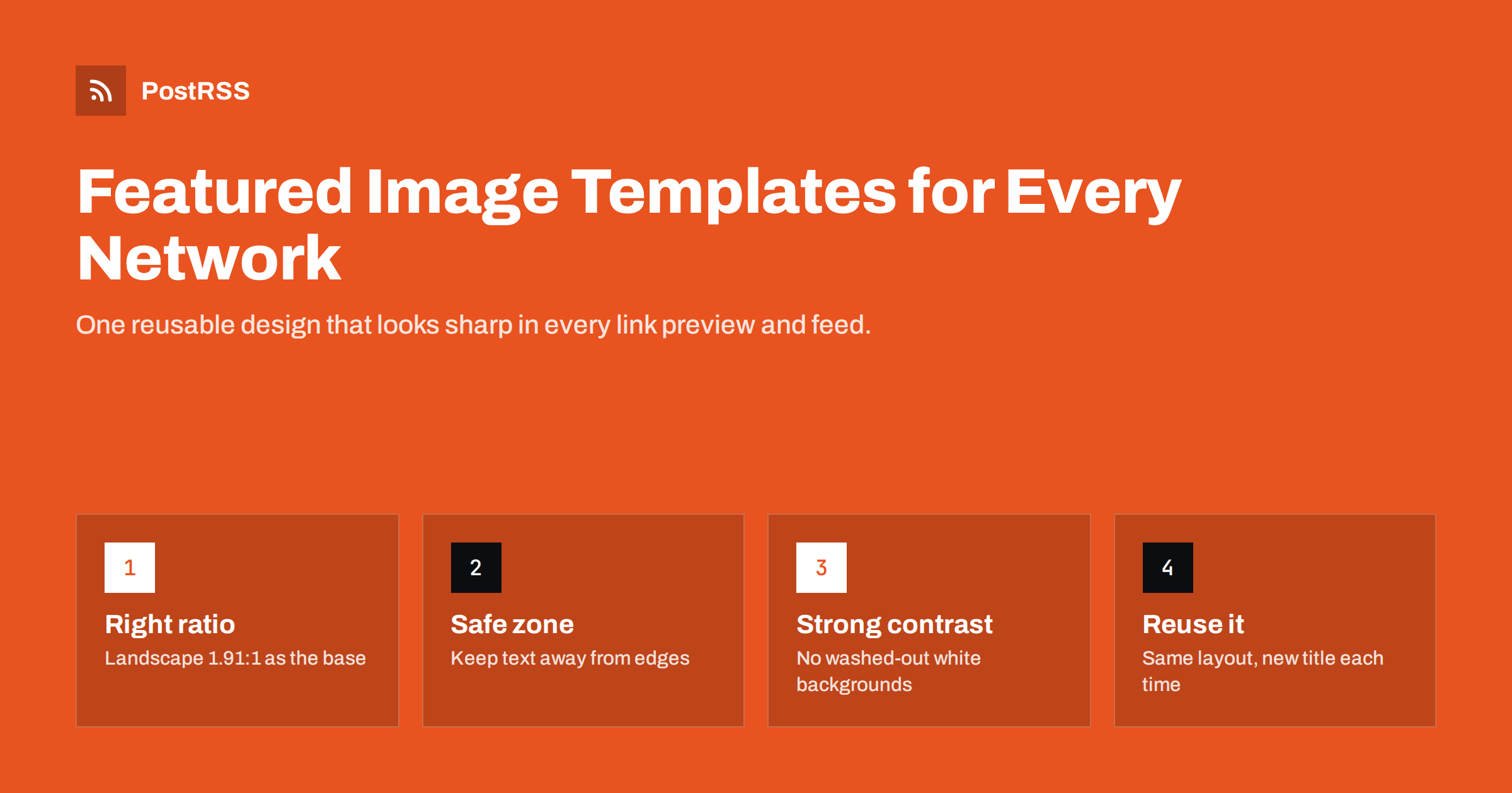
Short answer: A featured image template is a reusable design for your blog’s main images, built so every post looks good as a link preview on Facebook, LinkedIn, X, messaging apps and search results. Start from a landscape canvas of about 1200 by 630 pixels (1.91:1), keep the title and logo inside a central safe zone so crops do not cut them off, use a few large words with strong contrast, and avoid plain white backgrounds that disappear in light-mode feeds. Set the image as the post’s featured image and Open Graph image, and every auto-posted link will carry a consistent, recognisable picture.
When a blog post is shared, whether manually or automatically from an RSS feed, the image is usually the largest part of the preview. On most networks, people see the picture first, then the title, then perhaps the description. A clear, attractive image makes a post stand out in a crowded feed; a missing, blurry or badly cropped image makes it easy to scroll past.
Featured images also appear in places you may not think about: search results on some engines, news aggregators, messaging app previews, feed readers, team chats and your own blog’s archive pages. A single good image does a lot of work across all of them.
There is also a practical reason to care: platforms rarely let you fix an image after an automated post has gone out. If the preview is weak, the post stays weak for its whole life on that network. Getting the image right before publication is far easier than trying to repair previews afterwards.
The problem for most blogs is consistency. Designing a unique image for every post takes time, so quality varies: one post has a striking custom graphic, the next a generic stock photo, the third nothing at all. A template solves that. It fixes the layout, fonts and colours once, so each new post needs only a new title and perhaps a new photo.
Different networks display link previews in different shapes, but the landscape ratio of about 1.91:1 is the most widely used for link cards. A canvas of 1200 by 630 pixels is the common reference size; creating it at double resolution, such as 2400 by 1260, keeps text sharp on high-density screens while keeping the same proportions.
Some places show images differently:
You cannot design one image that is perfect everywhere, but you can design one that survives cropping. That is what the safe zone is for. Our social media image size cheat sheet lists current dimensions per network.
File format matters a little too. JPEG or WebP work well for photographic templates, while PNG keeps flat colours and text crisp. Whatever you choose, check that the networks you post to accept the format for link previews, and keep file sizes modest so previews load quickly on mobile connections.
A safe zone is the central area of the image that stays visible even when the edges are cut off. Keep everything important inside it:
Platform interface elements also cover parts of images. Play buttons, domain labels, overlaid titles and rounded corners can hide small details near the edges or bottom of a preview. A comfortable margin keeps your design clear of them, whichever app the reader uses.
Test the template by cropping it to a square in the middle. If the title is still readable and the image still makes sense, it will cope with most previews.
Most previews are shown small, especially on phones. Text that looks fine on a designer’s monitor becomes unreadable in a feed. Practical rules:
Text on images is not readable by screen readers unless it is repeated in alt text, so always write alt text for the featured image, usually matching the article title. See alt text on auto-posted images for what reaches each network.
A useful habit is to write the image headline separately from the article title. The title is written for search and clarity and may be long; the image headline is a short, punchy version of the same idea. Many teams add a field for it in their CMS so the person writing the post decides it at the same time.
Colour is what makes a template recognisable at a glance. A consistent brand colour or small palette lets followers identify your posts before they read a word. Some guidelines:
One template is good; a small system is better. Many blogs use three to six layouts that share fonts, colours and logo placement, so consecutive posts do not look identical while the brand remains consistent. For example:
Write the rules down in a one-page brand sheet: canvas size, safe margins, fonts and sizes, colour codes, logo placement and the list of layouts. That sheet lets freelancers, new colleagues or an automated generator produce images that match the rest of the blog without guesswork.
Rotating layouts and backgrounds in a fixed order keeps your feed and blog archive varied. Tools range from design apps with shared templates to scripts that generate images automatically from the title, which suits teams publishing often.
A good template only helps if the image actually reaches each network. When posts are shared automatically from your RSS feed, the image usually comes from one of two places: the feed item itself, or the article page’s Open Graph tags. To make sure your template is used:
og:image and, where relevant, as the Twitter card image.Older posts deserve attention too. If you introduce a template after years of blogging, consider updating the featured images of your most visited and evergreen articles first. Those are the posts most likely to be shared again, and a consistent look across old and new content makes the whole blog feel maintained.
If previews show the wrong image, the guides on Open Graph tags and wrong preview images и controlling which image gets auto-posted explain the usual causes.
Once the template is live, review a sample of recent posts on each network every few months. Look at them on a phone, in both light and dark mode. Small problems such as a logo that is too close to the edge or a colour that looks muddy on one network are easy to adjust in the template once and fix for every future post.
PostRSS shares each new post from your RSS or Atom feed with its real image, taken from the feed item or from the article page’s Open Graph tags, so a consistent featured image template carries through to every network you connect. It posts to 66 networks, including Facebook Pages, X, LinkedIn, Pinterest, Telegram and many others, and each post and error is visible in the posting log if an image fails to load. The features page explains how images and message formats are handled.
A featured image template turns every blog post into a recognisable, professional preview wherever it is shared. Build it on a landscape canvas, keep text inside a central safe zone, use few words in large type, choose strong colours instead of white backgrounds, and create a small set of layouts to rotate. Make sure the image is set as the featured and Open Graph image, and your auto-posted links will look consistent on every network.
A landscape image of about 1200 by 630 pixels, a 1.91:1 ratio, works well for most link previews. Creating it at double resolution keeps text sharp on high-density screens. Pinterest favours vertical images, so consider a separate version for it.
A short headline of a few words in large type helps previews stand out. Keep it inside a central safe zone and repeat the meaning in the alt text. Avoid long sentences on images.
White or very pale images blend into light-mode feeds and search results, so they can look like empty boxes. Saturated brand colours or dark backgrounds are more visible in both light and dark modes.
One is enough to start. A small system of three to six layouts that share fonts and colours adds variety while keeping your brand recognisable.
Usually the Open Graph image is missing, points to a different picture or is cached by the network. Check the og:image tag on the article page and refresh the preview with the network’s debugging tool.
What changed in the networks, what broke, and how to fix it before it costs you reach.
 English
 Lietuviškai
 Deutsch
 Français
 Русский
 Español
 Polski
 Italiano
 Українська
 Čeština
 Português
 日本語
日本語 Latviešu valoda
 Eesti
Eesti Magyar
 Bahasa Indonesia
 Türkçe
 हिन्दी
 Ελληνικά
 العربية
 ไทย
ไทย Tiếng Việt
 Română
 Bahasa Melayu
 বাংলা
বাংলা